Project Overview
House2Home is a startup web platform that helps customers to plan their new living space with home decor under a limited time and budget.

Roles
Ideation, UI design, user testing
Identify the Problem: We Don’t Live in Fantasyland
Everyone likes visually-pleasing home decor. It’s a crucial part of a home owner’s stylish statement. We also love looking through glamorous showrooms and can’t help but envision what it feels like to reside in such a place.
Except you don’t. The commercial showrooms, with their eye-catching walls, well-lit studio lights, and professionally arranged decorations, resemble nothing of our ordinary living space. Especially after checking the price tag of even the smallest item, we soon realize: yes, this is just a fantasy (and yes I'm a fan of Bohemian Rhapsody).
Scenario & Persona

Imagine a 24-year-old fresh out of school graduate who just landed her first dream job in the big city, starting a new chapter of life in her small one-bedroom apartment or studio. Moving, furnishing, plus rental and deposits had costed quite a fortune so she doesn’t have much means left for decorative accessories.
Like the majority of her generation, she browses for design inspiration from lifestyle magazines and blogs. Yet her fantasy bubble was soon busted by the harsh difference between media portrayal and her own apartment, knowing she couldn’t simply copy and paste the magazine look into her own space. It wasn’t just a cost issue. Even after looking through a long list of items on a decently priced home decor site, she is still having a hard time selecting what is right for her apartment, under a $250 budget. And between a new job and adjustments to the city life, she simply doesn’t have the extra time to look through the clearance pile at local department stores, which would’ve been a recommendation from her retired grandma.
This scenario sounds extremely similar to our college and post-college days. Well, maybe not my husband’s college days. He (and guys of his likeness) was satisfied with any place that provides a bed and a bath, paid zero attention to any type of stylish display. Until we got married and his definition for “home” was elevated to a whole new level.
Not the Designer’s Way
I have always been a keen fan of home decor. As a professional graphic designer, I have the advantage to illustrate the potential decor items in their (almost) accurate sizes & colors and visualize everything put together in my living space. Well, this is a rather makeshift illustration; a professional interior designer would’ve rendered everything accurately and beautifully in 3D.

Even a flat graphic illustration of an interior space can be time-consuming, as it requires accurate measurements & coloring, and the effort to browse for the right items.
However, most of our target audience — having no access or prior knowledge to the professional tools — cannot approach their decor problems in the designer’s way. This is where “House 2 Home” comes to the sprint, to design a digital platform to help new apartment/house settlers to stylize their space with economical decor items.
Competitive Analysis
Glancing across a number of the largest budget-friendly brands across the industry — Target, IKEA, Etsy... and lifestyle blogs such as Apartment Therapy, we are starting to see some of the most common resources and tools that help customers to plan their decor. IKEA and Target use personalized planning tools to help users to visualize specific items in their space; it may be the closest solution to see a virtually planned personal space, but the solution doesn’t always guarantee a perfect performance as it relies heavily on the speed and operating levels of their devices. IKEA may stand out more with its pre-sorted under-budget collections. Apartment Therapy gives realistic tips and tricks to revamp one’s space at a low cost, however, it is debatable whether our customers can actually afford the extra time spent on DIY works. Etsy’s massive collection of handmade decors provides abundant options, yet having too many options may be time-consuming to look through and can stand in the way of quick decision making.
Collectively, a lot of pros and cons need to be taken into consideration in order to choose what to build for the minimum viable product. At least, it becomes clear now that this project should be developed into a responsive website for the ease of accessibility without putting the burden for users to learn a new tool or software.

Mapping, Sketching & Prototyping
Mapping the user’s journey helped to frame a comprehensive overview of the starting and ending point. It soon became apparent that the most crucial step is to put together a personalized solution that meets the user’s space, style, and budget.
Moving quickly to 8 sketches to visualize the critical components of the site. The most important and perhaps the most complex part is to customize a decor design that matches the user’s needs.
Enter the site
Browsing the site
Choosing & customizing
Complete purchase

A storyboard was soon constructed under the user’s journey to set grounds for a prototype that comes in a more appealing form.
Under time constraints, the initial prototype was far from completion. I personally had little, or no clue of how to make the most crucial step come alive, no clue of how to put together the user’s dream decors into a virtual reality space that doesn’t involve a 3D rendering tool that crashes someone’s device.
But I will leave the users to tell me what makes a satisfying solution from their thoughts and interactions with the site. This is where user testing comes to its full advantage and help me discover the most crucial elements and the most pressing issues.
Testing & Findings
The testing participants were recruited based on their similarity to the target persona. Everyone is a member of the young workforce, living in a compact space, and could use some help from housing decor if they find the right items at the right price.
As expected, the user-driven results were proven to be much more comprehensive than my own state of mind. Below is a summary of the important feedback I have received, a number of which were contrary to my original assumptions:
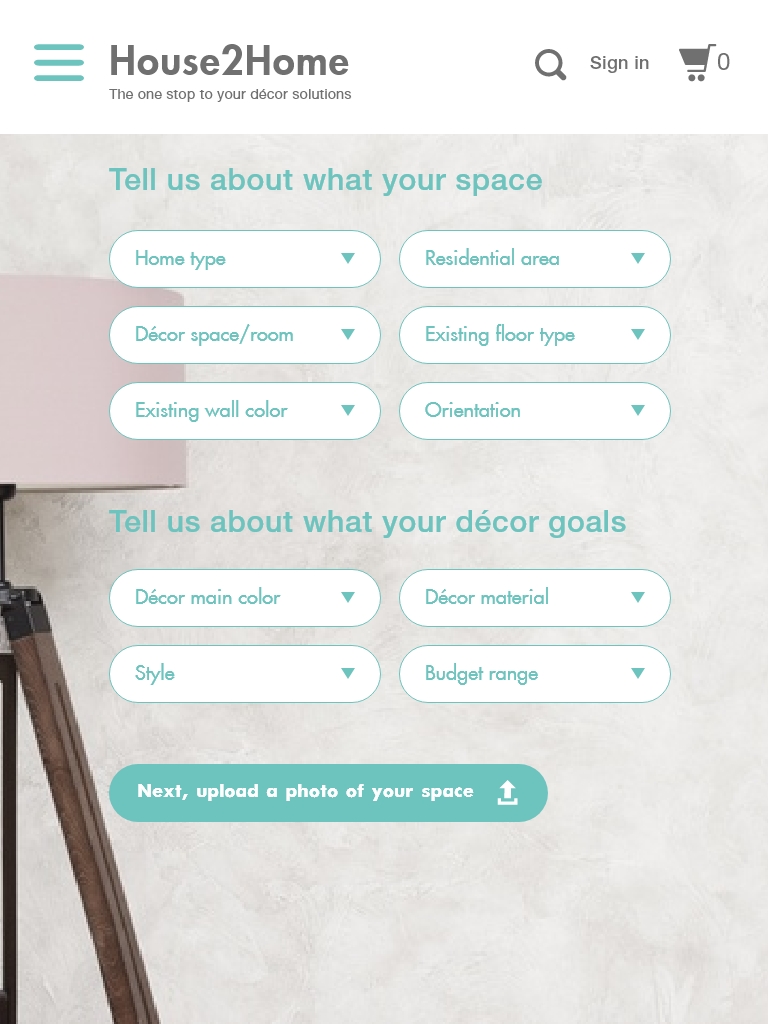
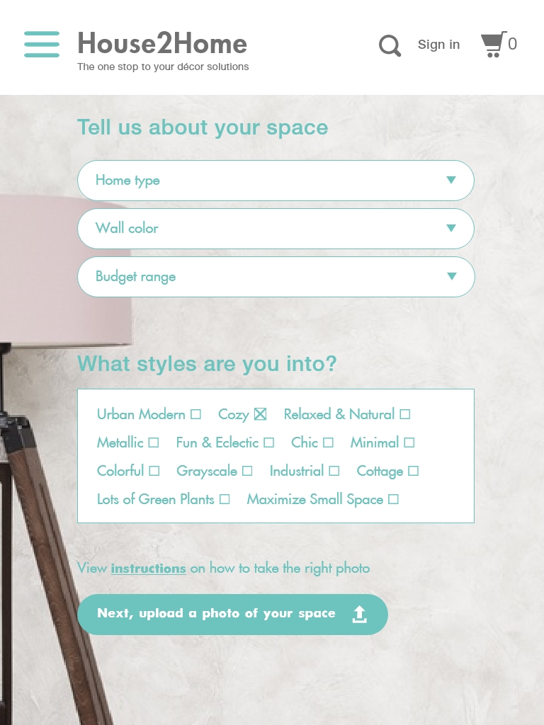
Customizing options page (after “start” button): the number of options and filters appeared overwhelming and bothersome; some were even confusing (i.e. - many were not able to understand what “residential area” and “orientation” meant) and seemed irrelevant to the user’s goal (“floor type” may have nothing to do with decor choices); it takes time for people to think and learn about each category which is the least of the user’s interest. Improvement: take away all categories that require overthinking and keep only the essentials, such as home type, wall color, and budget range; style can be kept as an optional choice, or re-write in a more “amateur” language, as some people may be clear about the styles they are looking for and some are not.
Room photo upload: most users probably do not know how to take a decent photo of their room and could end up using a photo with poor quality, taken at the wrong angle, or with bad lightning, which could affect the end result of a personalized styling. Improvement: add a link or hidden section that shows instructions on how to take a room photo in the proper way.
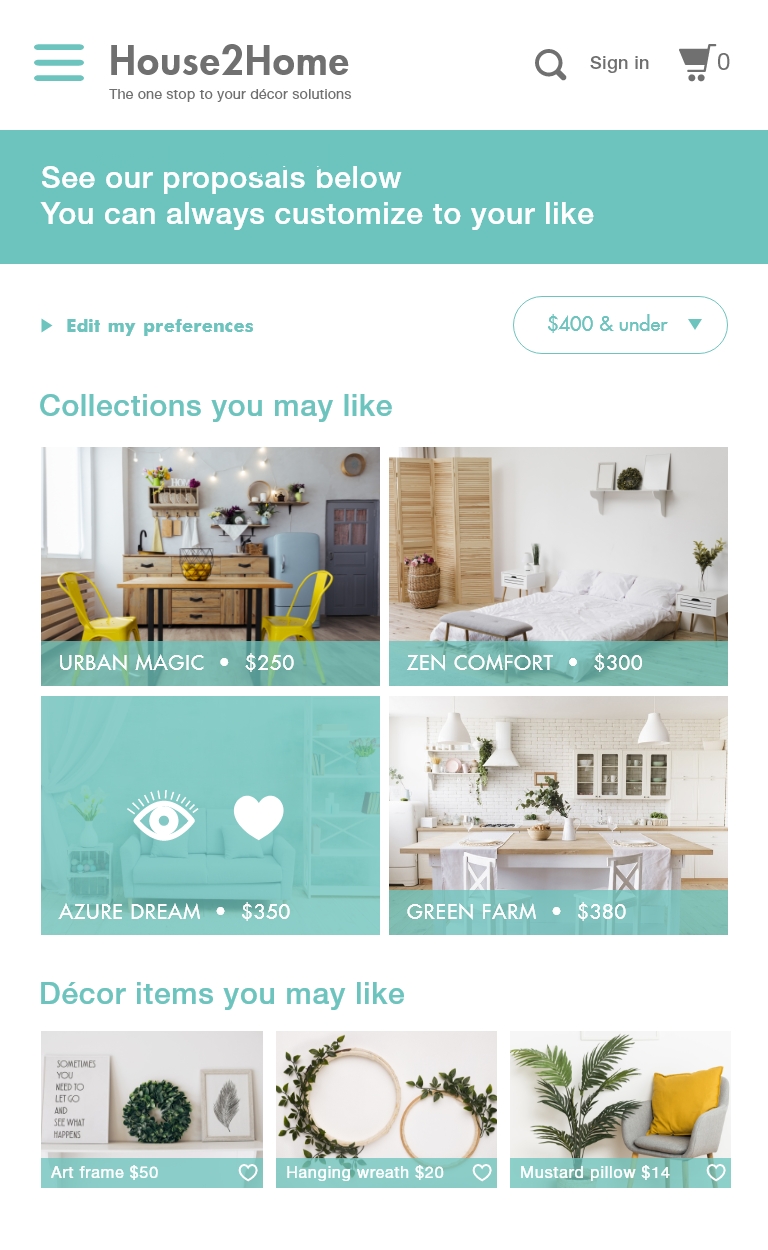
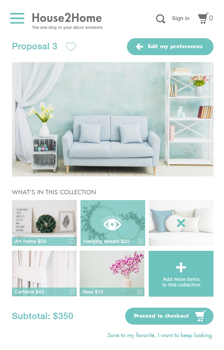
Customizing results (proposals) page: the design specific terms can act as filters to help users narrow down choices once they see what the collections look like, such as colors, style, materials.
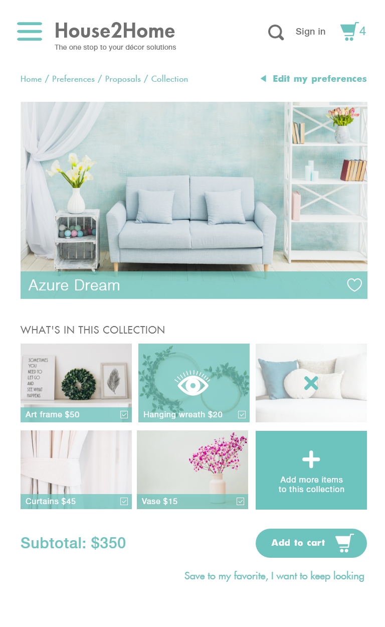
Single collection page: consider using the uploaded photo as the static background and place suggested decor items on top; all items should be moveable and replaceable. This was suggested by one of the participants — which I found agreeable — as a solution to customize without occupying too much bandwidth.
Single item page: make sure there is a link that can take the user back to proposals’ page; if the item is directly viewed without being a part of any collection, pair up with similar items or recommendations; can also consider adding a section that includes photos taken by real customers in their homes to show a more realistic view. It also provides a channel for users to share their decor accomplishments; people tend to gain a positive feeling after showing off.
Checkout: add a step that allows the user to view their cart prior to checkout; it feels a bit compelling to ask the user to “pay your money now” without a chance to review their shopping list.
Other minor adjustments: make sure there is always a way for users to step back to the previous page and back to home page; collection page should have an overlay for the selected item to indicate current viewing; “add to cart” button can be bigger while “quantity” window can be smaller; add icons next to product names on the menu.
Last but not least, the best feedback I have gotten above all is:
“Remember, you are a designer so you naturally think like one. You may know the designers’ language by heart and have a very clear idea of the style and color you are looking for. But most of us non-designers do not know how to set the right parameters and will rely on the site to show us the best option. So try throwing away your foreknowledge and you will have a better understanding of what’s best for the users.”
Revision & Furtherance
The testing phase has accomplished a major lift to the overall design. A significant amount of edits were made to simplify the customization step. Another rule of thumb I have found beneficial to bridge the gap between the user’s understanding and professional decor terms, is to leave standalone words in simplified (or “amateur”) language, and pair up any industry-specific terms with a visual aid.

The desired format for the customized decor illustration page, another important part of this site, still remains uncertain at this point. It may require another round of testing to see if a manipulative virtual illustration will lead to more user engagement and resulting in an increase in revenue. Alternatively, the user may also lose interest from having to learn a new tool, or lacking the confidence to polish the designs on their own. Yet at the end of the say, I — as the UX designer — should always remember to set aside my own bias and route the journey in the user’s footsteps.






Comments