Project Overview
The app is designed as a tablet kiosk to help hospital visitors to navigate to their appointments, popular points-of-interest, and to request emergency services.

Roles
User research, information architecture, UI design, user testing
Researching into the Problem Scenario
Quotation source: Finding your way in the hospital mega-complex
"According to a report by Deloitte Digital, 30% of first-time visitors get confused and lost in hospitals. Even staff members have trouble with wayfinding. A quarter of staff report difficulties in finding critical destinations within the hospital."

Endless corridors, indistinguishable doorways, with the smell of sanitizing alcohol and the sound of rapid footsteps in the air, steering your way inside urban hospitals are no less challenging than a life-size maze.
Let’s not forget that most hospital visitors (aka patients) arrive at the destination with pre-existing physical illness and emotional stress, which effortlessly turns a simple task such as finding your way from point A to point B, into rocket science.
Now, you may ponder, shouldn’t the hospital reception desks solve all visitors’ problems like they are supposed to? Yes, but not all.
Considering the patients’ existing stress levels and heightened sensitivity, not everyone is in the comfort zone to approach in-person assistance. Not to mention things like language barriers and physical disabilities can also hinder one’s inclination to speak with a receptionist.
Even for patients who are sociable enough to carry out a conversation and acquire answers to their questions, they generally do not share the same level of understanding with the hospital staff.
While listening to the staff give directions by referring to common areas or landmarks, the patients (especially new ones who need the most help upon their first visit) are already having a hard time processing what does that landmark looks like or how would they know they have passed it?
Also, it’s not uncommon for stressed-out patients to forget their exact route halfway through, leaving them with the choice to look lost and feel foolish, or randomly stop any personnel dressed in uniform to ask further guidance, which in turn, can abruptly delay medical staff from their assigned duties. At the end of the day, it’s a situation that puts a frown face on both ends.
"Stressed out patients often have limited cognitive capacity, or have trouble navigating using letters and numbers alone."
Approaching the Solution
The right solution to a smooth hospital journey should tackle a number of pain points discovered above: lower the patients’ stress levels, provide straightforward answers, and not requiring extra memory or a new learning process. It should cover all the main functions of a reception desk, yet in a more efficient and less stressful way.


The medium is ideally iPad pro or a tablet screen of similar dimensions, which allows a decent viewing parameter but not over-sized. It wouldn’t be comforting to have a big screen where everyone can see you searching for your doctor in the Dialysis Department.
Some may wonder, can patients simply download a hospital app on their phone as live navigation? As a natural habit, users tend to keep a tool that they either come in frequent contact with or something that associates with a pleasant memory. Otherwise, it becomes a waste of phone storage. Hospital is not something that patients visit on a frequent basis, and it is rarely considered as a pleasant memory. Medical professionals and staff do go to hospitals as a part of their work, but they will not need help to navigate since they would all have been in the buildings long enough to know their way around.
Designing the Solution
Based on primary research and on-site observations of hospital traffic flow, the top destinations in a hospital can be categorized into the following areas:
Doctor appointments or physical exams/tests
Amenities (restaurants, cafe, restrooms, banks/ATM, gift shops, etc.)
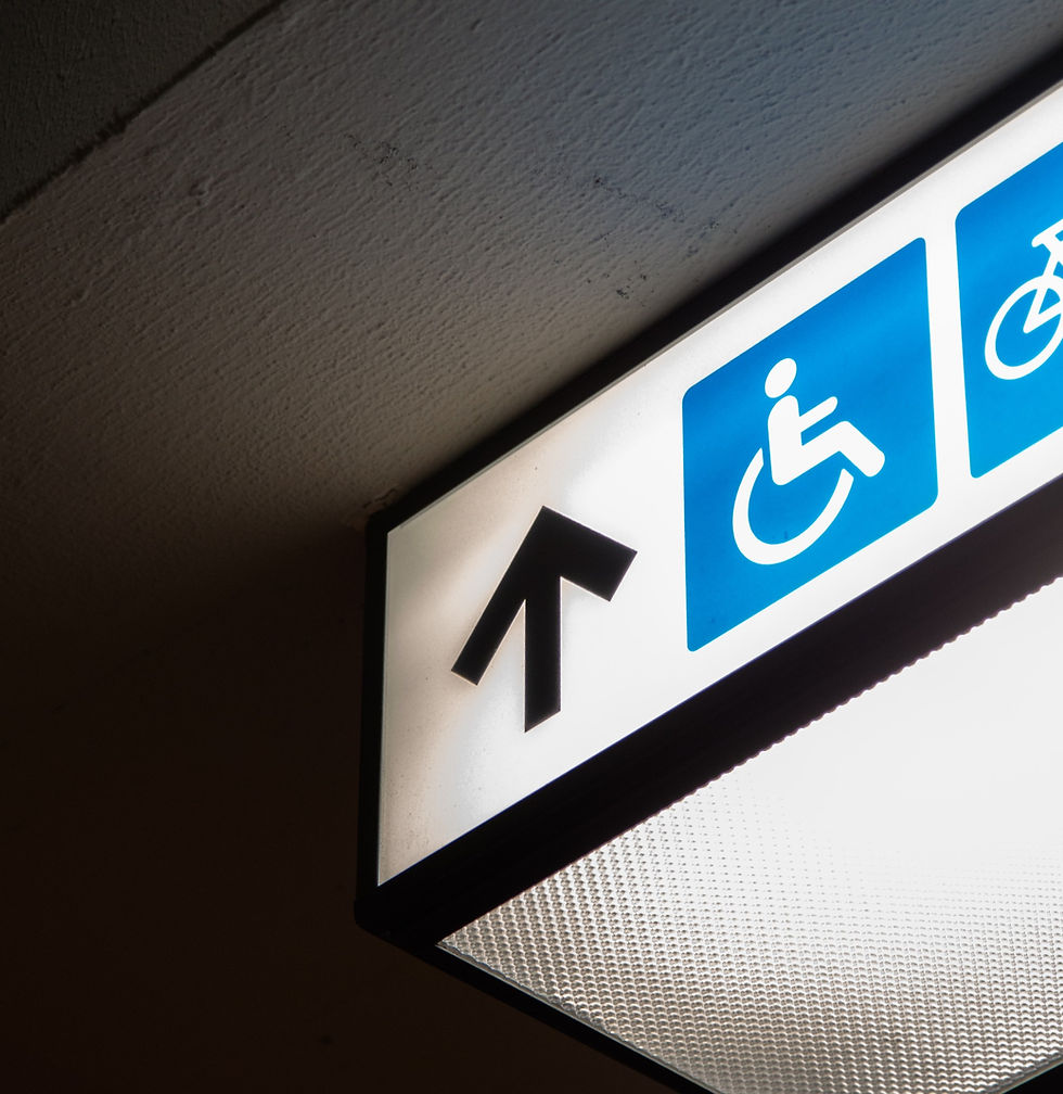
Emergency or immediate assistance
The tone and language should be proactive, short and sweet, to support a quick yet assuring service. The user routes should be designed with a minimal number of steps to avoid complications, and it needs to be available in several popular non-English languages.
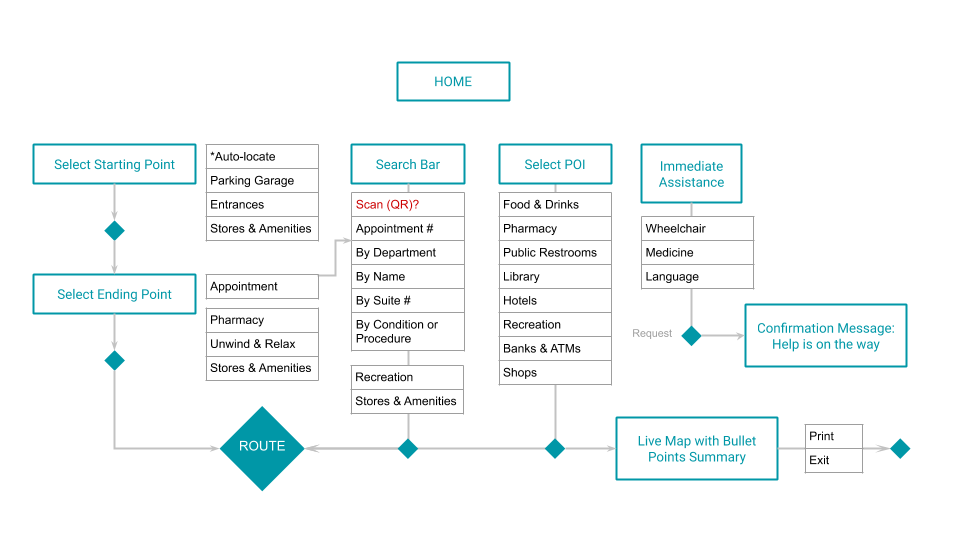
Then, a tablet app that aims to solve hospital navigation was underway. Here's what it looked like from sketches to wire frames.


Style Guide & Wire Flow


Prototyping & Testing
While transitioning from wire frames to hi-fidelity mock-ups, several key adjustments were made as a result of usability tests.
“First aid” is not a realistic service which hospitals provide; it was replaced with “locate emergency center” as a more popular demand
Footer bar is only necessary on the home page, as the user does not need to be reminded of the name of the hospital once they start using the app, it also occupies a valuable real estate
Every page or step should allow the choice to redo or go back to the previous state; this will help the user to be more at ease
Requests for immediate or emergency assistance should include a confirmation message before the actual assistance takes place, to avoid false alarms caused by a clicking mistake
Offer an alternative option for users who were not able to accomplish their tasks (i.e. - unable to find their doctors or destinations), this would prompt them to go to the nearest reception desk for further help


The purpose of this app is not to entirely replace hospital administrative staff, as in-person assistance is still crucial for places that manage the vitality of human beings. The product should function as a major source of delegation to the hospital administration, with the goal to relieve many shared burdens among the staff and patients.
If such a design becomes successful, perhaps someday the hospitals are able to operate in a fashion similar to many modern technology-driven airports where digital solutions contribute largely to efficiency and punctuality, under human supervision. The fine line between digital surface and human interactions may surprise us with endless possibilities.

Comments